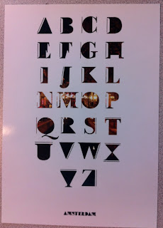
Brief Title:
A line inspired typeface and photo journal.
Background:
Look at street Art and graffiti
Typefaces which have a physical line in or which consist of line.
Look at black and white photography and other urban photographers
Considerations:
Different ways of constructing a line and integrating it into a typeface and how to give an idea of a connected series of events through photography.
The balance between a line and a photo.
Mandatory Requirements:
Consider the "A connected series of events, actions or developments."
A typeface
A type of Photo Journal
Some drawing
Deliverables:
A3 print outs of typeface
any size or type of photo journal.
Tone of Voice:
Serious and professional
Audience:
Yourself
I am very happy with the outcomes i produced from this project, i got to create my own typeface for myself based on Amsterdam, the only problems with this typeface i found was i put the N infront of the M in the alphabet layout, my least favourite letter is the N as well which if i had more time would of been good to keep working on. The hot dog book had a few problems i had encountered, the typeface wasnt that readable within long sentinces, it was good for phrases but this limited me to the amount of information other then photos i put in the book. I would of liked to put relevant information about each photo which would personally described the relevance of each photo.


No comments:
Post a Comment